A brand audit and visual identity refresh
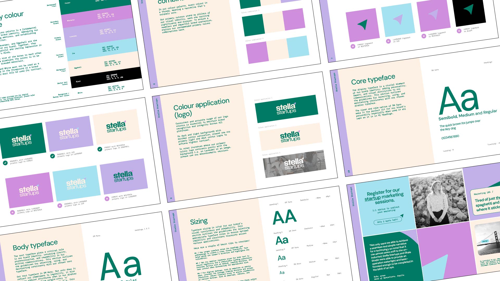
Helping a startup specialist look the part
Stella Startups is the marketing partner Aussie and Kiwi founders call when they're at the start of something, offering CMO-level strategy and hands-on execution without the agency puffery. The work was great, but the brand itself wasn't quite keeping up: the purples weren't reproducing properly in print, the logo had a few quiet contradictions in it, and the yellow-and-purple palette was starting to feel boxed in for a business that was clearly going to outgrow it. Basically, the marketer needed a marketer.
I started with a proper brand audit, looking at every piece of the visual system and asking whether it was actually doing the job the business needed it to do. Some of the answers were small, like new values for the purples so they actually printed, or rebalancing the logo so 'startups' supported the name instead of competing with it. The bigger call was the colour palette. Looking at where Stella was heading, yellow wasn't going to age well, so the new direction is brighter and more confident, built on bold continuous lines that nod to how the business actually runs. Less rigid, more fluid, future-proofed for whatever comes next.

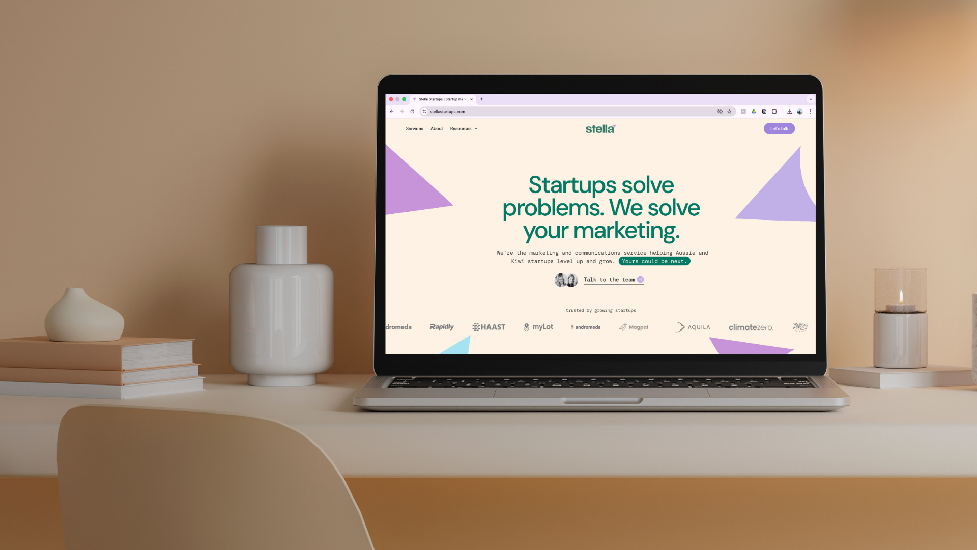

A brand that's finally taking its own advice
A clearer, more confident Stella Startups, with a visual identity that holds up across print and digital and a system that's easy to run with day to day. The new look lives across the website, social, decks, and templates, and it's already pulling its weight in pitches.
Website by Dream Lab