A clean energy brand that doesn't look like every other clean energy brand

Standing out in a sector that all looks the same
The sustainability and clean energy space has a visual identity problem. Endless greens and blues, leaf motifs, stock photography of solar panels. Every brand communicating the same things in the same way, and becoming invisible in the process.
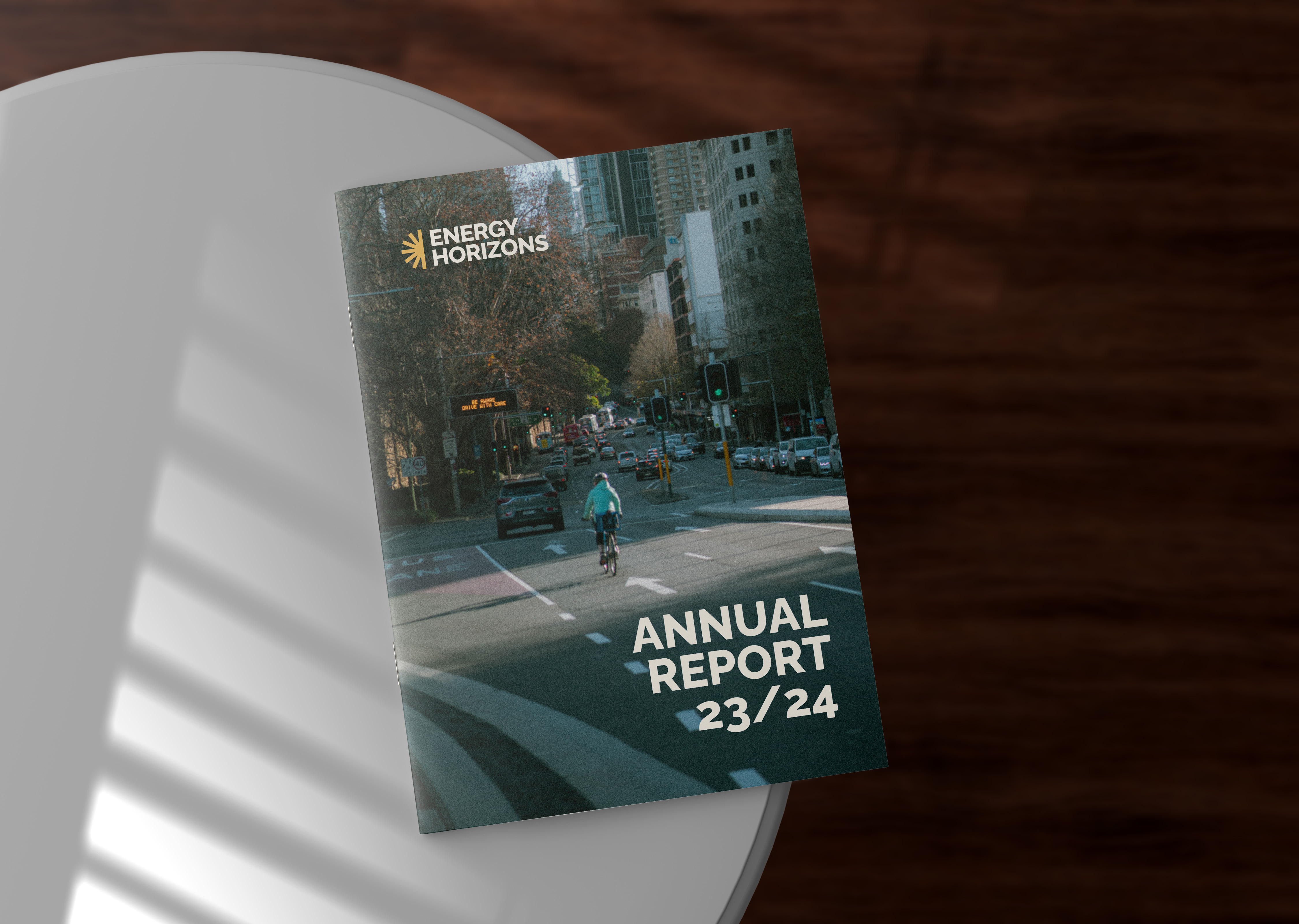
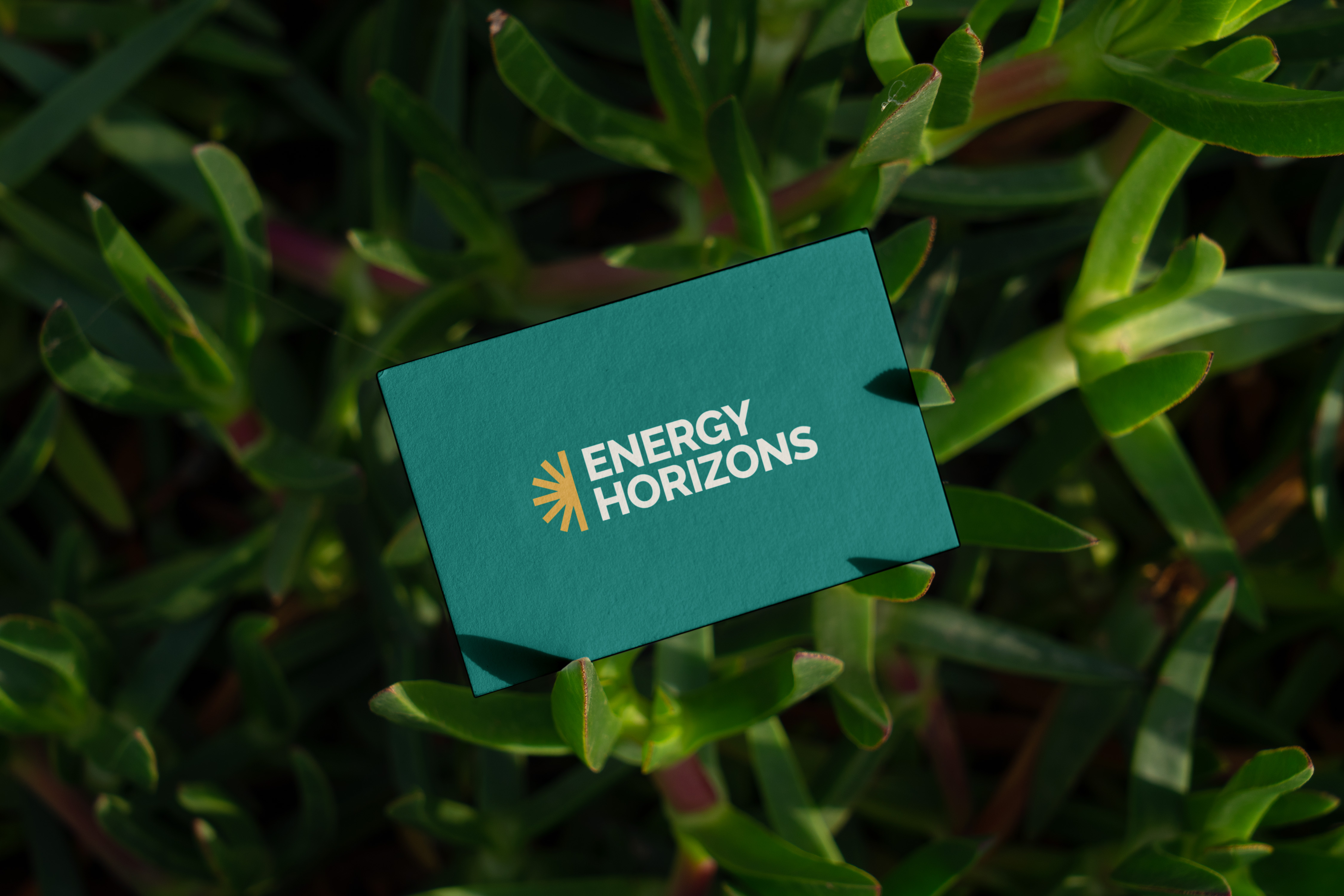
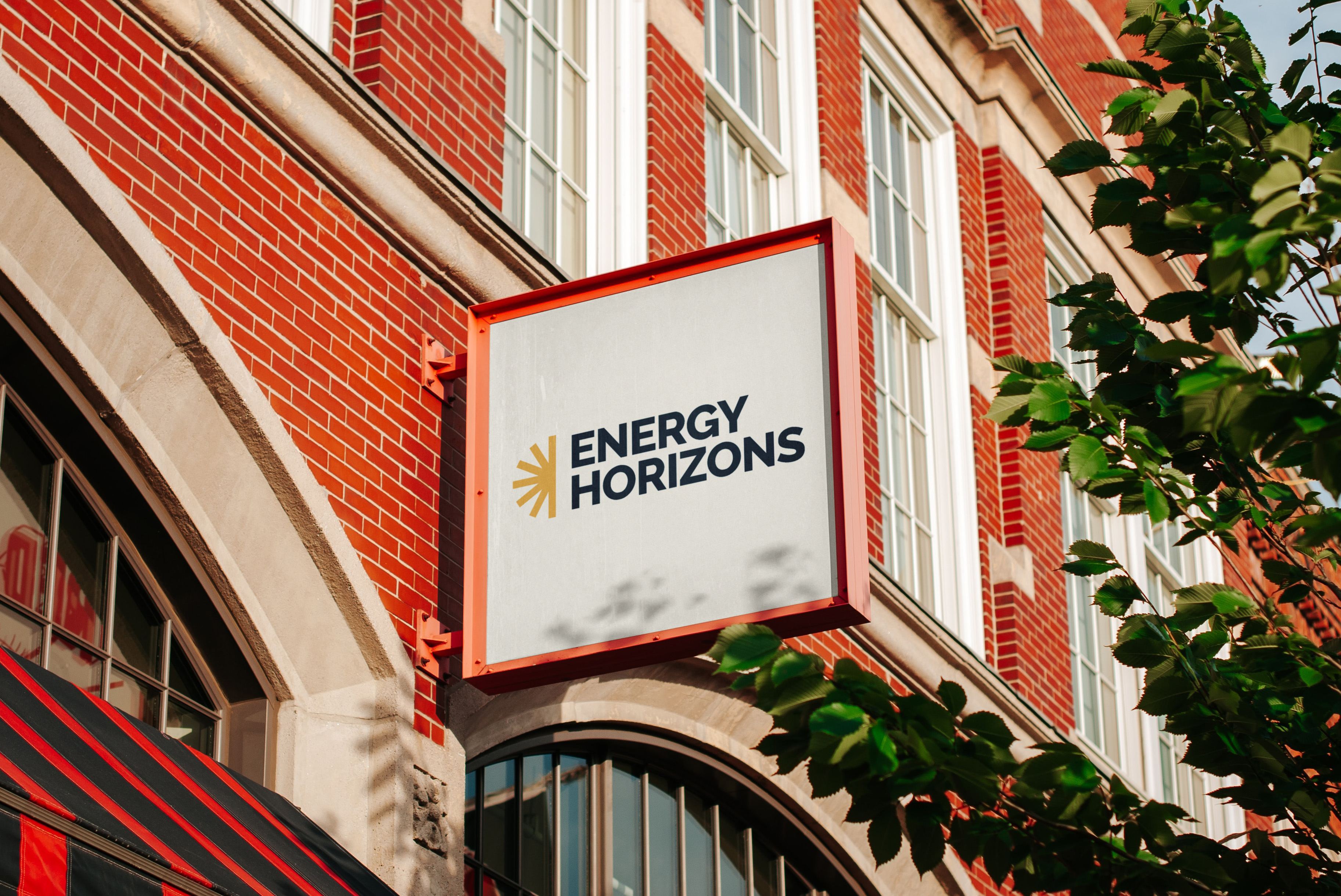
Energy Horizons needed to be different. A clean energy company with a serious mission in sustainability and decarbonisation that needed to look like it meant business, not just meant well. I built the identity around a sun symbol. A mark that any audience reads as power and renewal, without a leaf or a wind turbine in sight. The symbol became the core of the visual system, flexible enough to carry the identity across signage, stationery, and the annual report.
Full brand guidelines documented the whole system: colour, typography, logo usage, tone of voice. So the team could run with it independently from day one.


A brand that does the talking
Stronger brand recognition, a clearer market position, and a visual identity that holds up wherever it lands. The annual report, the signage, the pitch decks. It all coheres.
Energy Horizons looks like a company that knows exactly what it's doing, because now the brand says so.