
Identity
Torrens Arms Hotel

A brand refresh and two new sub-brands

the Challenge

From 'just a pub' to a place worth driving to

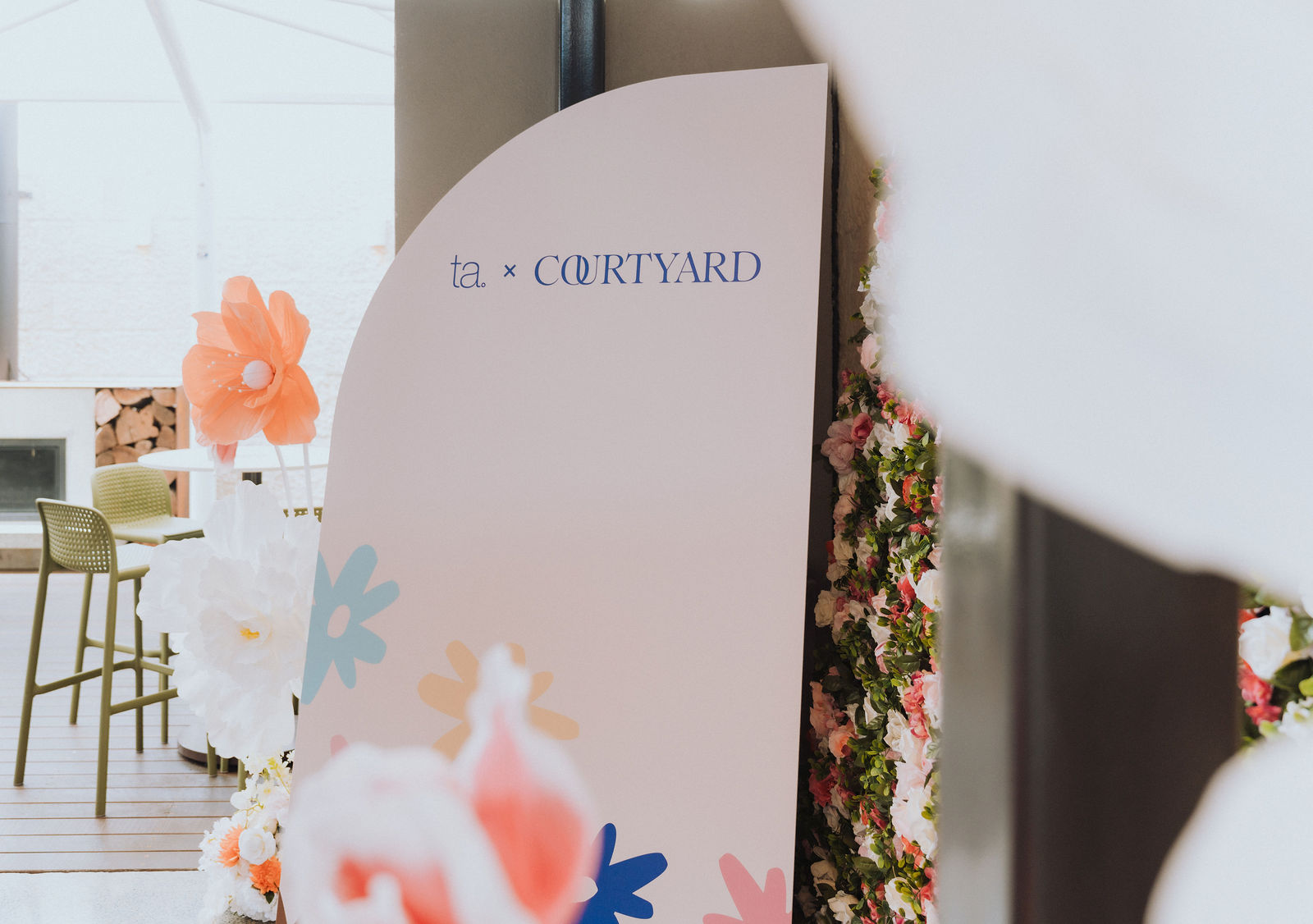
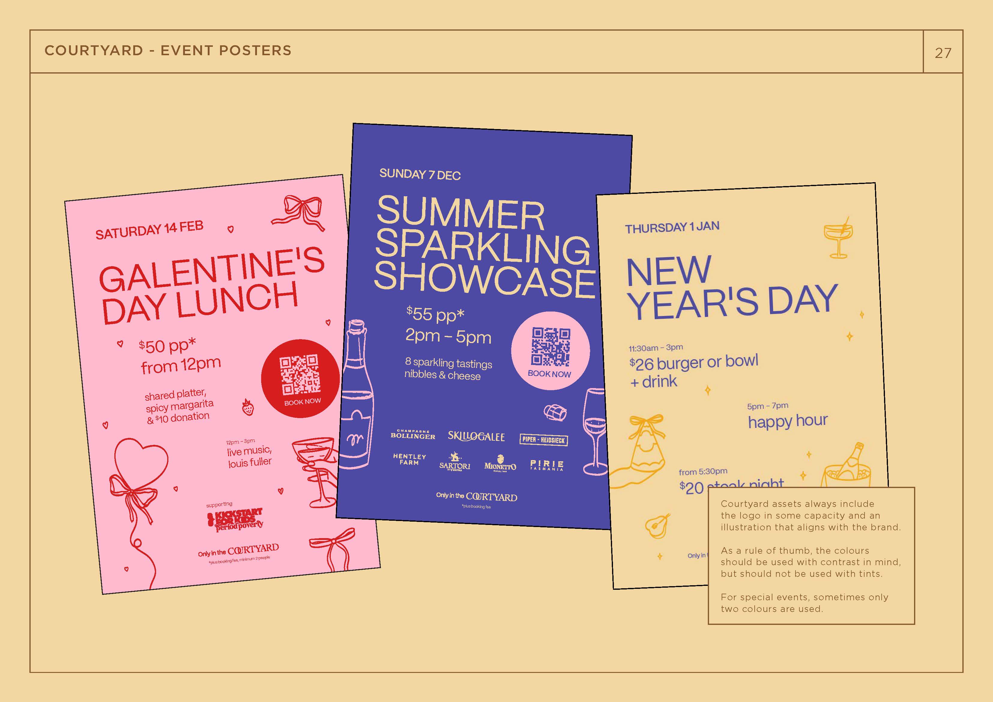
A $2 million refurbishment was underway at the Torrens Arms in 2025, with a new sports bar, a new outdoor courtyard, and a whole new energy. The brand needed to catch up. The TA had a loyal local crowd, but the perception was stuck a few years behind the kitchen, and the brief was to refresh the main brand and create two new sub-brands for the new spaces, each with its own personality but all clearly belonging to the same place.

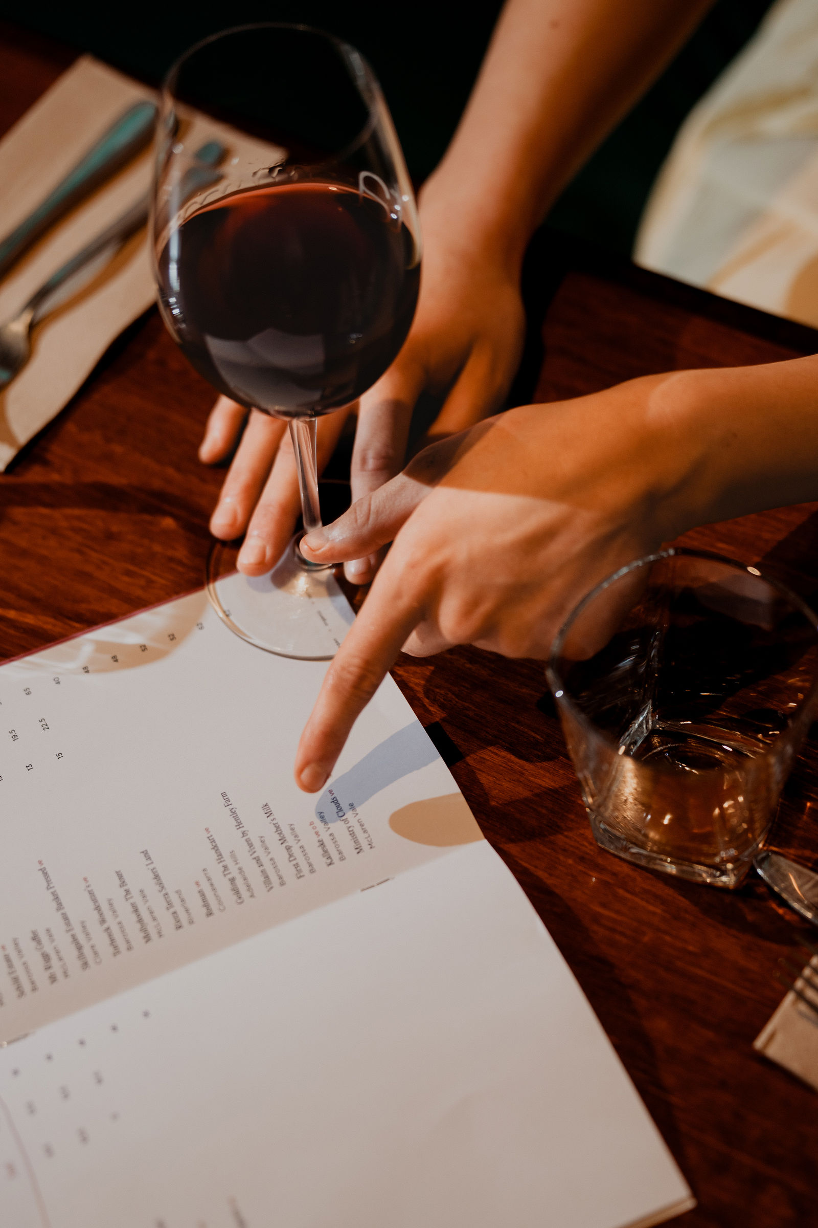
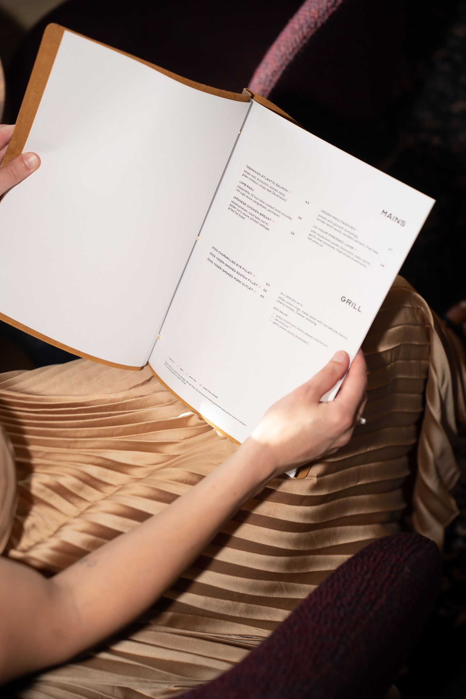
I led the rebrand end to end, developing palettes, typography, signage, and the rollout assets to land it across the venue. Each sub-brand got its own visual world, designed to feel like a real choice on a Friday night while staying connected enough that you never forget which pub you're in. Brand guidelines tie it all together, so the team can keep things consistent long after the launch fades.

No items found.
the results

Not just a pub anymore

A refreshed Torrens Arms with two new sub-brands, a real shift in how the venue is perceived in Mitcham, and a stronger position in a busy hospitality area. From 'just the local' to a food and experience destination.

Additional credits

Photography by Sam from Outline Creative